Data that tells a story - creating valuable insights for users.
Summary
In the pursuit of aligning Mimbly's products and services with user expectations, we delved deeply to understand our customers' needs and preferences. This effort led my team and me to develop solutions that enhance user satisfaction and engagement while creating important new revenue streams for the company.
Time frame
Jan 2024 - May 2024
UX research, UI design, Performance data
Drip by Drip
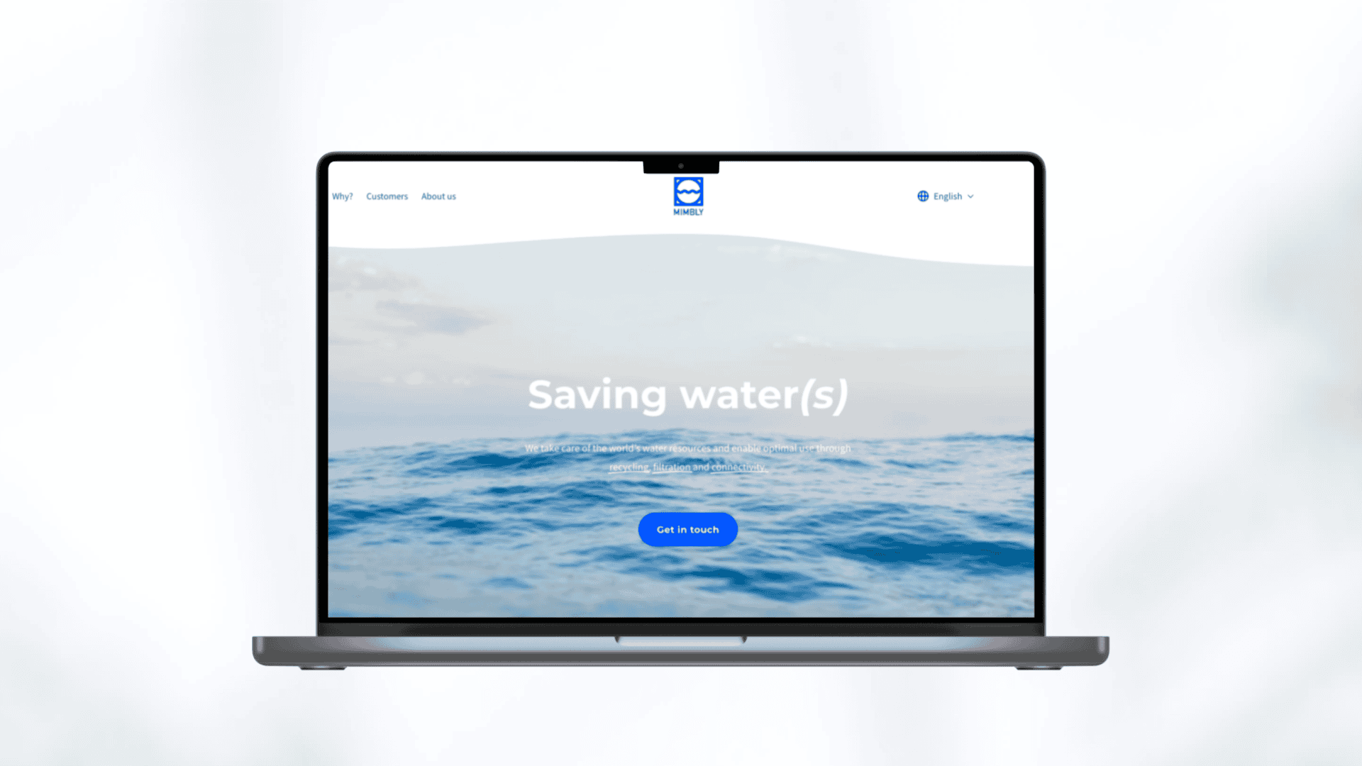
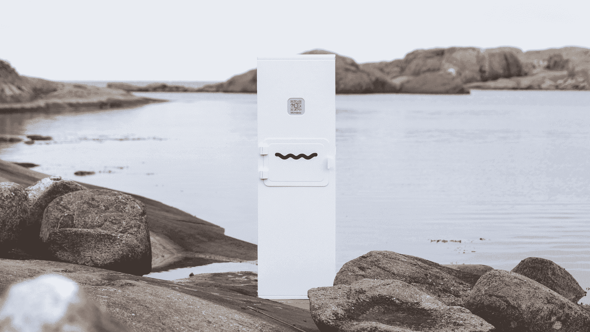
Mimbly's Mimbox Preserving Water Resources
Mimbly's flagship product, the Mimbox, stands as a testament to
Mimbly's commitment to sustainability. Designed for businesses with
professional laundry machines, the Mimbox revolutionizes water
conservation and reduces microplastic pollution in laundry operations.
Mimbly develop solutions to drive sustainable change.
Secondary research
Extracting insights
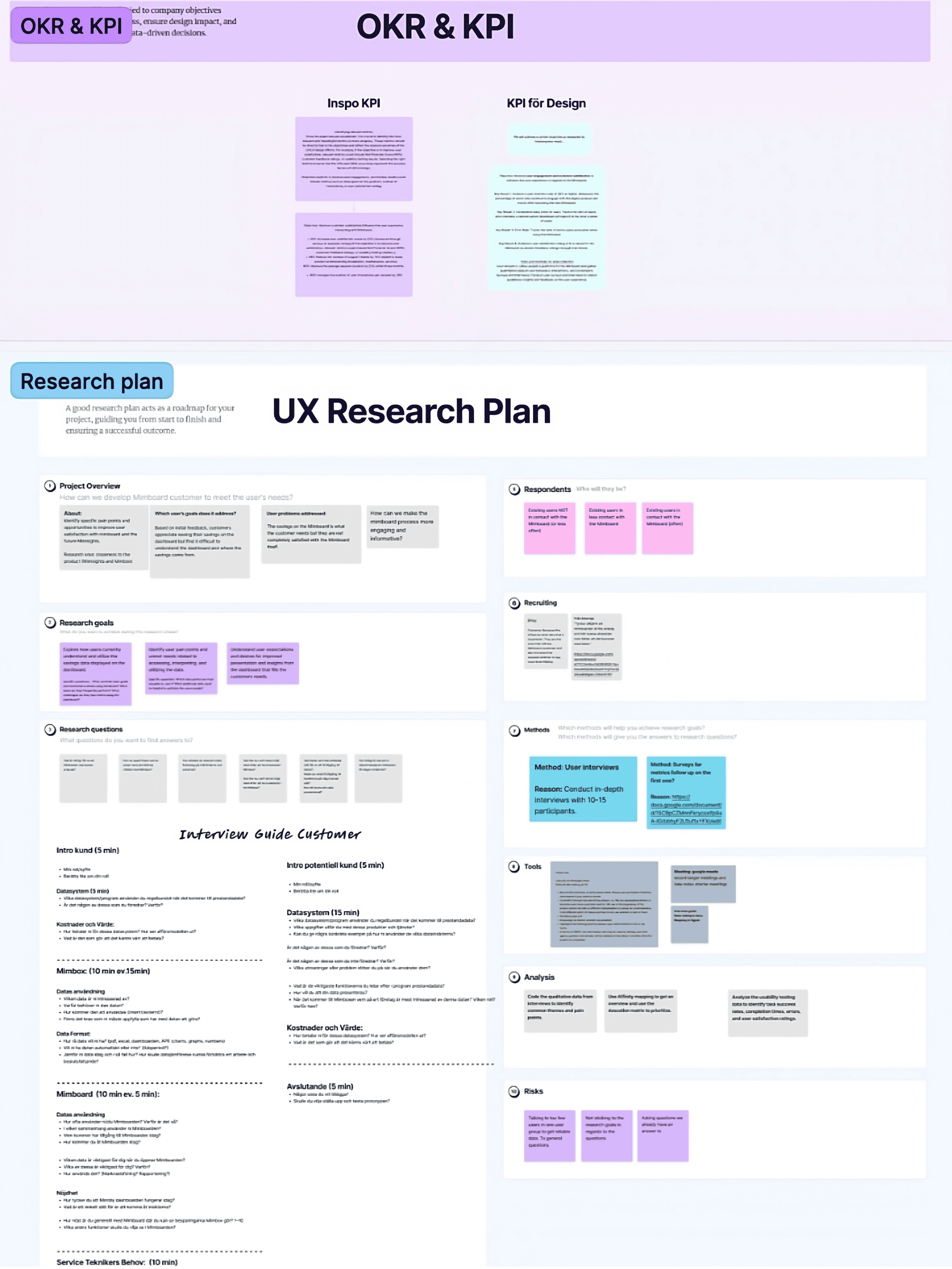
In the initial stages of the project, comprehensive secondary research provided invaluable insights. My goal was to identify gaps and ensure we didn’t overlook critical information, enabling us to make informed decisions. This approach proved not only cost-effective but also essential for developing a strong research plan and identifying key metrics.
By conducting this research, I was able to define the right KPIs for the design, ensuring a data-driven approach to measuring success. I
also created a project plan using Jira.
Insights:
-
There is a need to enhance the dashboard, which was underutilized.
-
To satisfy our diverse user base, increased flexibility is
essential.
- Customers wishing for alternative reports.
Project Objectives:
-
Increased loyalty and brand advocacy by boosting user engagement
to strengthen the relationship between Mimbly and customers.
-
Enhance customer satisfaction by helping users utilize the data
from the Mimbox improving the user experience and maximizing the
utility of the product.
-
Combining business growth with customer-centricity by enabling
economic revenue for Mimbly's digital products while
simultaneously increasing customer satisfaction
Research Overview
Focusing on UX maturity
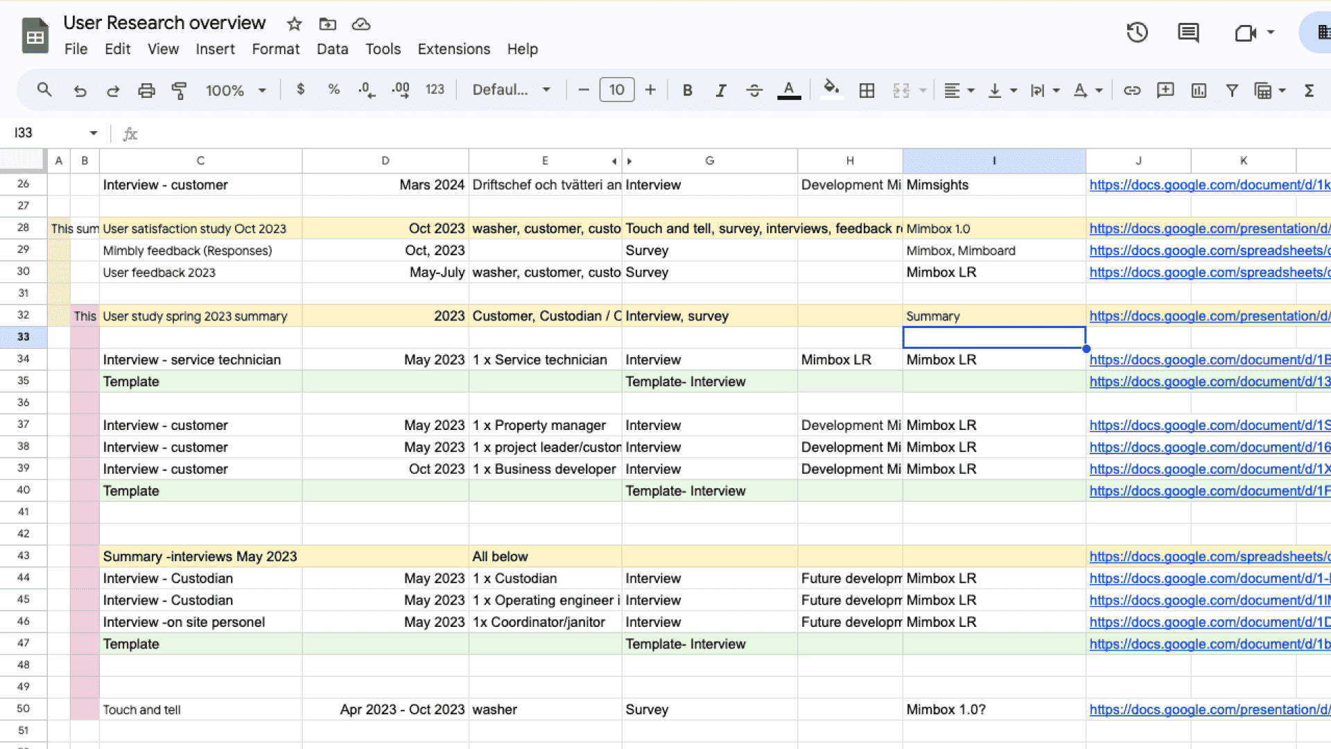
To structure and enhance the accessibility of research across the
organization and elevate UX maturity, I developed a research
overview for internal use. Additionally, I also created a separate
list to provide an overview of users who previously contributed to
various research points.
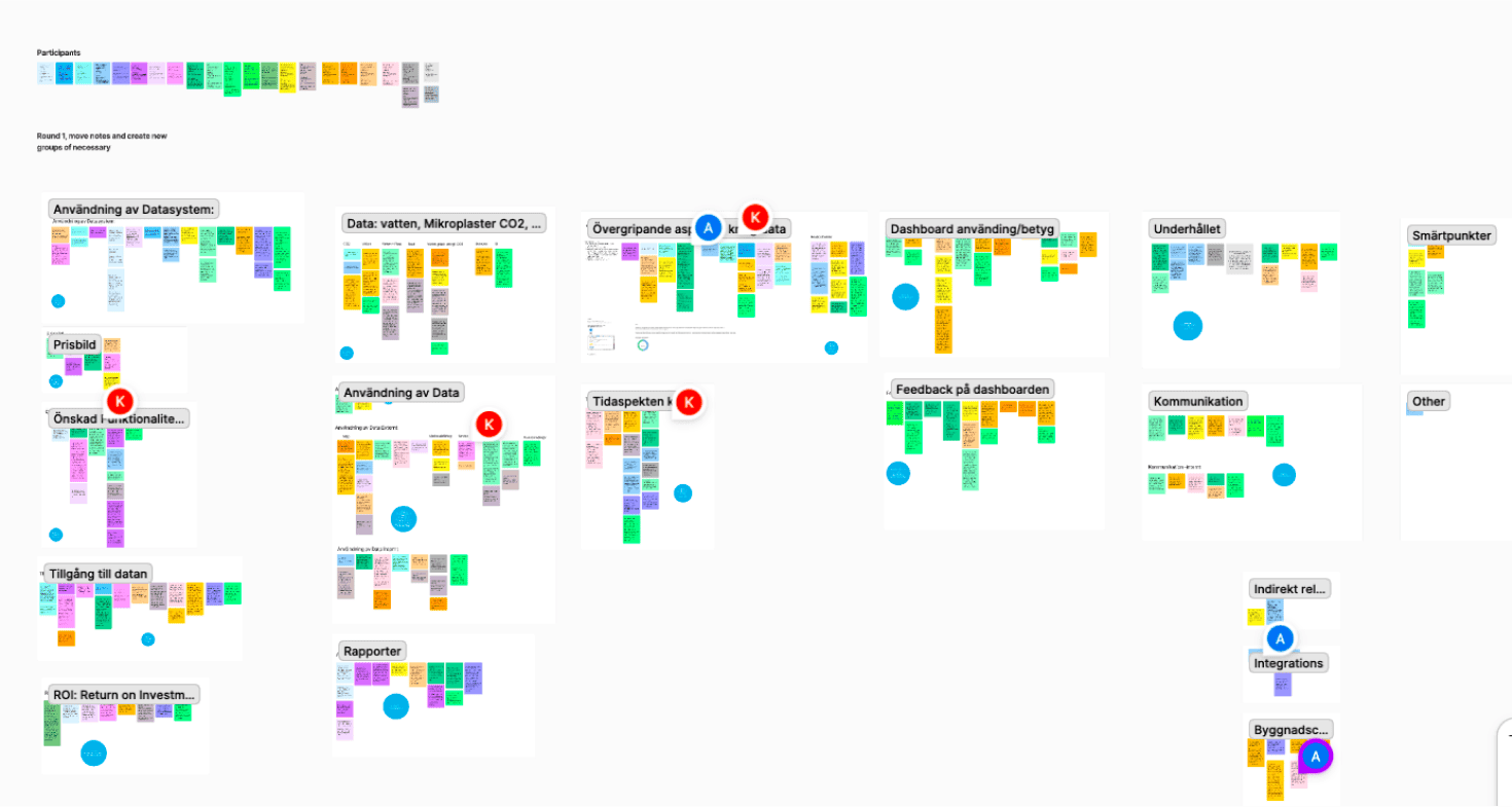
User Needs
Navigating Broad User Groups
Our user base encompasses diverse needs, with the majority
representing property management and facility maintenance sectors.
User research with 15 potential and existing customers highlighted
the underutilization of our dashboard often without a clear goal and
the importance of tailored reporting options.
Insights from research on user needs:
-
Users want to be able to collect and analyze data insights in
order to find deviations.
- Compare the performance across different properties and identify emerging trends.
- Compile data from all Mimboxes and analyze individual box data.
- They want to understand increases in savings over time.
-
Users also want to ensure the reliability of data for internal and
external use.
-
Lastly, they need easy access to data for evaluation and
sustainability reporting to tenants and customers.
From Insight to Impact
Recurrent data-driven insights for users.
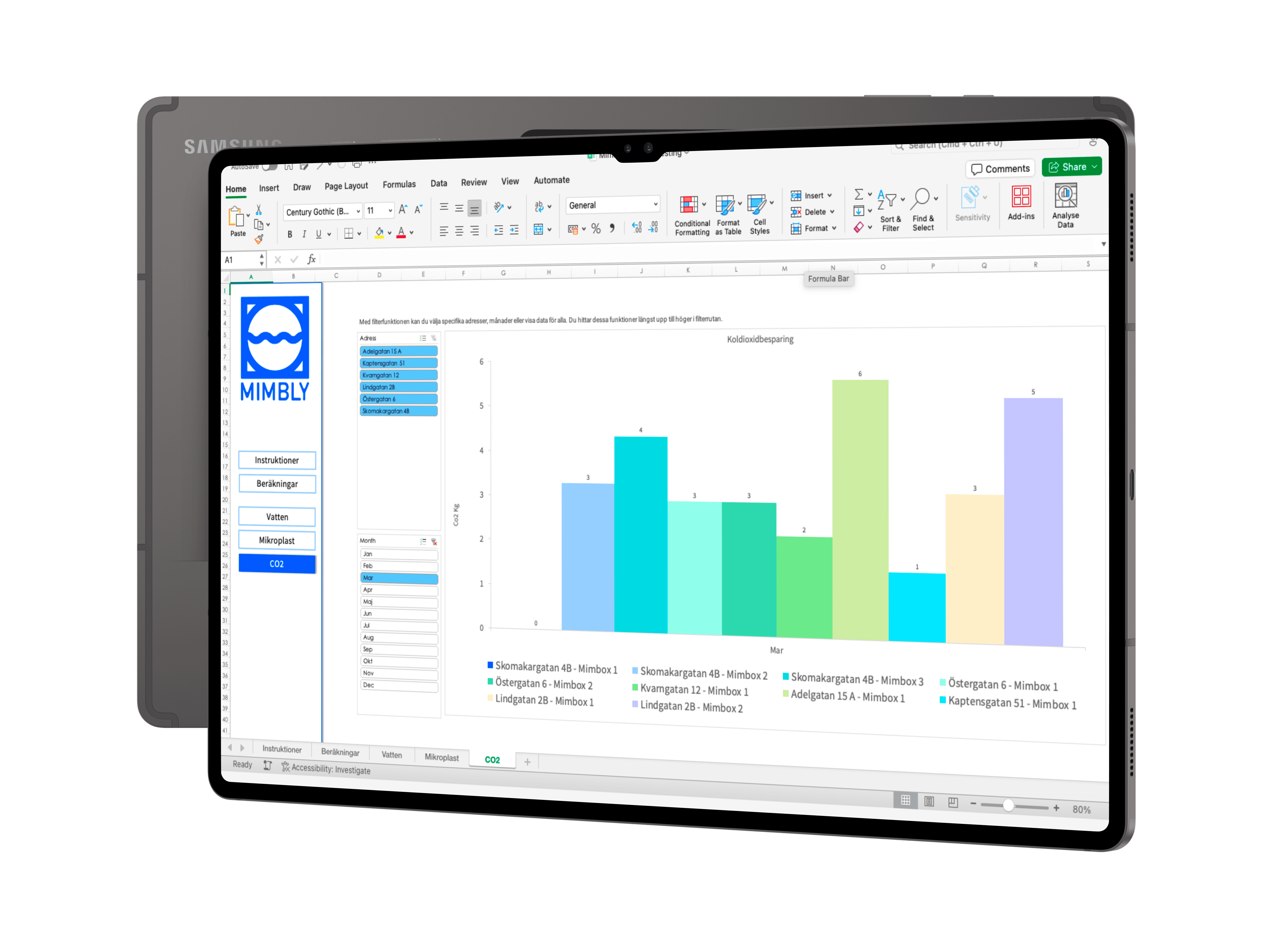
Our approach to meeting user needs involves multi-level reporting,
with Excel reports as the initial tier. Excel was selected due to
its familiarity among users and research indicating a preference for
easily accessible data reports.
Monthly Excel reports aim to enhance users engagement and simplify
the users experience while streamlining access and promoting
sharing. However, continuous research will be required to assess
user behavior accurately.
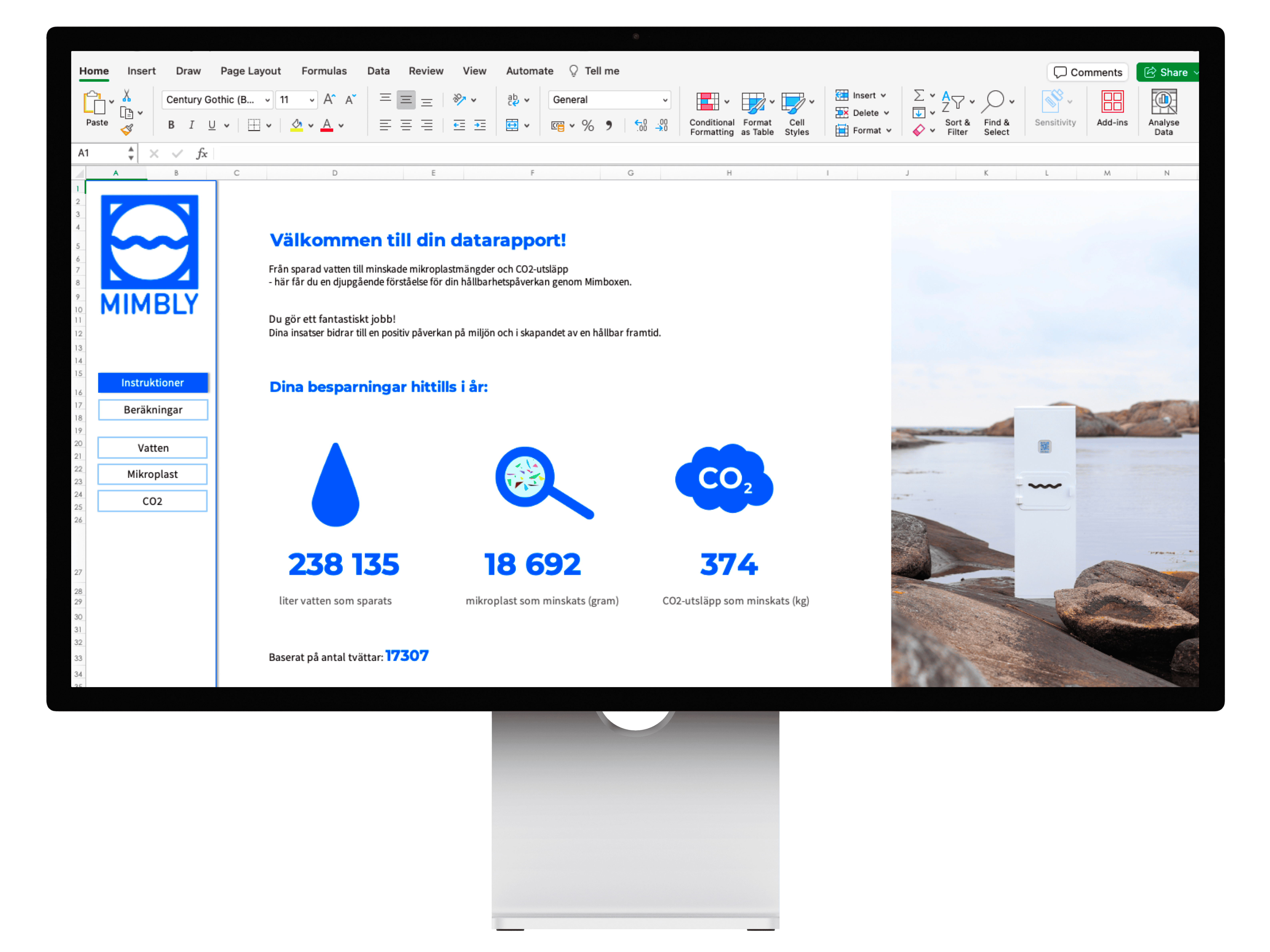
To transform the report into a visually appealing dashboard, applying
the design principle of aesthetic design, I introduced a menu for fast
navigation and content overview. Experienced Excel users can still
navigate using tabs at the bottom, maintaining familiarity.
Additionally, the report includes an instruction page to guide users
and a page for methods and calculations, addressing the clear need of
data reliability identified through UX research.
User satisfaction SEQ
An increase from 6 to 8 – A Valid Achievement
The prototype tests indicate that users found the report and its
diagrams easy to navigate, enabling them to compare data over time and
across different utilities, while also facilitating the identification
of discrepancies from the data. These needs were insights derived from
our research.
Overall satisfaction with Mimbly's data distribution has increased
from an average rating of 6 to 8 on a scale ranging from 1
(unsatisfactory) to 10 (highly satisfactory). Considering this is the
initial level of the report system, an 8 rating is more than valid.
Business value
Increasing Mimblys revenue growth
This approach will enhance Mimbly's relationship with customers on a
monthly basis and better align with their needs. However, there is
room for further development, particularly in enabling multiple levels
of customization in reports to cater to the broad user base.
Ultimately, this strategy aims to increase revenue for Mimbly,
enabling faster company growth.

Refinement Over Perfection
Insights from Broad Research Scope
Insights emphasized the importance of initiating tasks promptly, even
without clear guidelines, as it´s easier to refine along the way than
to wait for perfection. This was particularly evident in our broad
research scope, where predicting a clear path was challenging.
Therefore, we opted to develop a reporting system to assess its
effectiveness. Despite the diverse user segments, we aim to satisfy
all by introducing additional report levels.
Furthermore, I learned a lot about designing with constraints in
Excel, which required a significant amount of skill. Although I was
not completely unfamiliar with the program, understanding all its
functions was crucial to designing a report that could meet user
needs. I started by drafting wireframes to avoid being restricted by
Excel and to clearly define my goal and the ultimate user experience.