Accessible public transport for all with Västtrafiks digital services
Summary
In this UX project for Västtrafik, my team and I significantly streamlined their ticket purchasing process, reducing the time for transactions, for student tickets, by 25%. This was achieved through focused UX research, innovative design, and iterative testing, leading to a more intuitive and efficient user experience.
Time frame
Aug 2022 - Jan 2023
UX research, UI design, Performance data
Public transport, a lifeline for many.
Västtrafik's digital services are a crucial tool for nearly 450,000
daily users, highlighting the service's significant impact on
people's mobility and overall quality of life. This case study
unfolds our journey to refine Västtrafik's digital touchpoints – to
meet and exceed modern user expectations.
Imagine this: you're rushing to catch a tram or bus, and you find
yourself wrestling with a complex ticket purchasing process.
Frustration mounts as the clock ticks.
This wasn't just a hypothetical situation but a real challenge faced
by Västtrafik's users. Our mission was to untangle this amongst
other issues, crafting an intuitive, stress-free experience.
But how do you visually enhance a complex public transport app with
loads of important information to communicate and with minimal
space?
Unveiling the Hidden Truths
We dove into the world of our users, employing personas based on
surveys to mirror the users journeys. These personas showed tha the
users prioritise efficiency and effectiveness, mirroring the user's
desire for a quick and straightforward path to their goals. This
approach was instrumental in tailoring our research and design to meet
actual user needs.
Using moderated usability testing with Lookback based on scenarios
from the persona, we gathered rich insights into user behaviour,
emotions, and thought processes. We employed a mix of qualitative
coding and statistical analysis to distill these insights into
actionable themes.
Some of our findings included the conclusion that users had difficulty
accessing the student discount. Additionally, participants were
noticeably confused and frustrated with the favourite trip function,
as well as with locating travel options, such as finding the bike
option.
User metrics
25% Increased efficiency
We compared the metrics from tests on the original app with the
metrics taken during the wireframe test of our solutions.
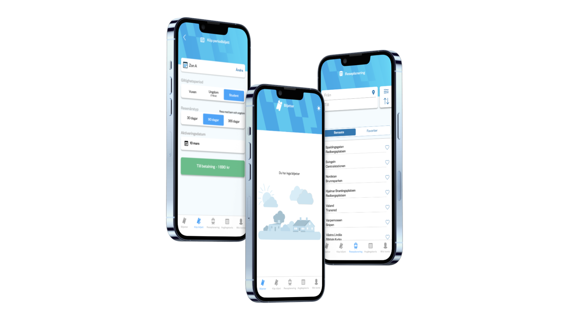
Our solutions significantly improved the user experience. The
introduction of a student ticket button reduced the time to find a
student ticket by 25%. However, challenges remained with the favorite
function, indicating the need for further refinement.
"What a great button for students”
- A student participant
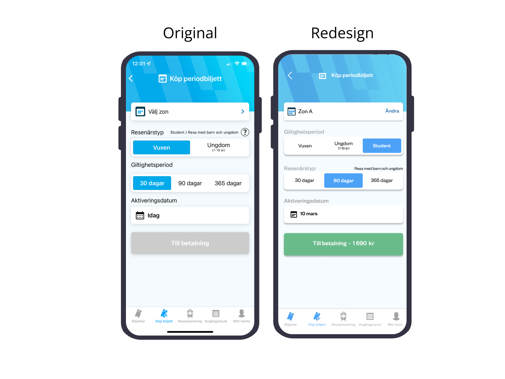
Adding a button for a student ticket in order to enhance the user
experience and guarantee the users will find it. This was based on the
need to build a inclusive app.
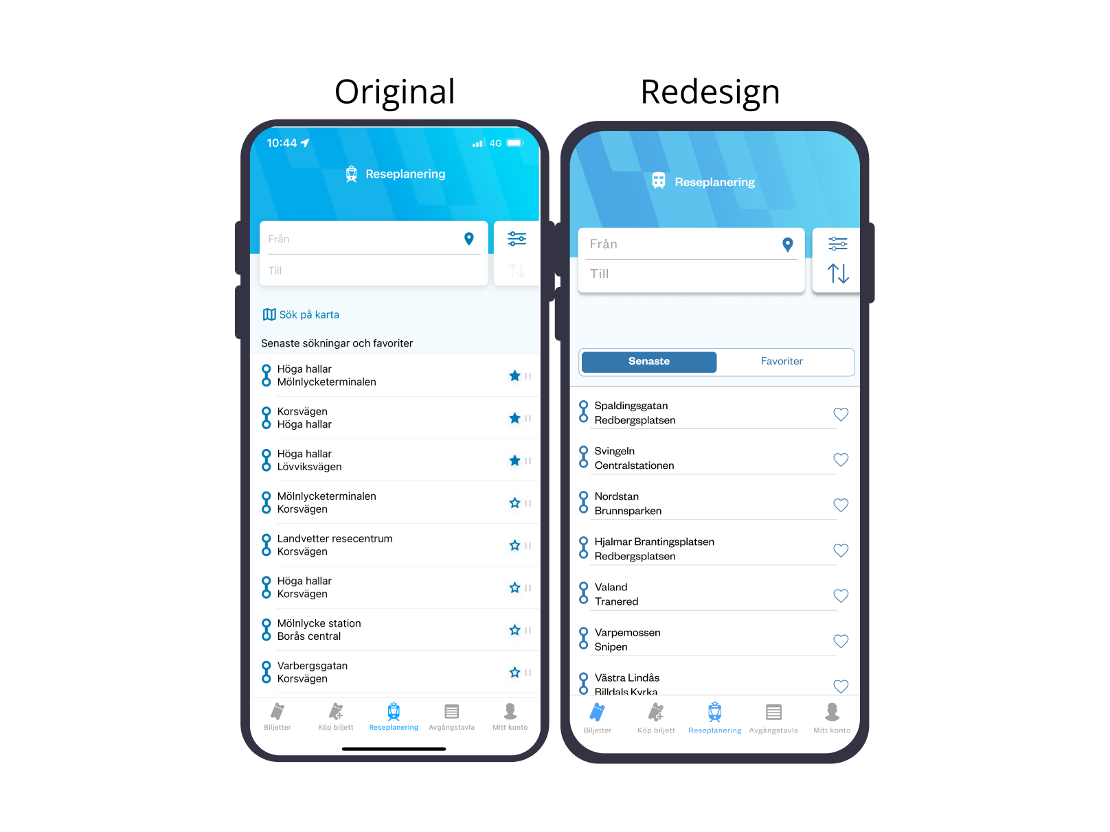
To help users find their list of favourite trips, we created a
separate tab exclusively for favourite markings. We also added a heart
icon that appears when a full trip is searched. This approach
eliminates the need for users to navigate back and then mark a
favourite in the 'recent trips and favourites' list, thereby reducing
cognitive load.

Learning by doing
Know your participant prerequisites
I realised the importance of background checks and understanding a
person´s familiarity with a product, especially if it already exists
in the market. Two participants were already familiar with
Västtrafik, but one had never seen it before. It is important not to
overlook this factor, even if it means putting more effort into
finding suitable participants, as it can impact the result.
Allocate resources more effectively
During the wireframing phase, we sometimes felt the urge to add more
details to the design to improve its visual appeal before testing.
As we move forward, I learned the importance of staying focused on
our testing objectives and limiting the amount of time spent on
mid-fi wireframing. In future projects, I will work on setting clear
time constraints for wireframing to ensure we allocate our resources
more effectively.